HTML layouts give you a way to arrange web pages in a way that is well-behaved, well-structured, and responsive. You could also say that HTML layouts tell you how to arrange web pages. Layout is how the visual parts of an HTML document are put together.
When making a website, the web page layout is the most important thing to keep in mind so that the site looks professional and good. Frameworks based on CSS and JAVASCRIPT can also be used to make layouts for designing responsive and dynamic websites.
Every website has its own layout that shows the content in a certain way.
HTML Layout Elements
Here are some of the HTML5 elements that are used to describe different parts of a webpage.
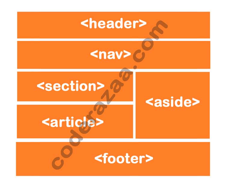
<header>– Defines a header for a document or a section<nav>– Defines a set of navigation links<section>– Defines a section in a document<div / article>– Defines an independent, self-contained content<aside>– Defines content aside from the content (like a sidebar)<footer>– Defines a footer for a document or a section<details>– Defines additional details that the user can open and close on demand<summary>– Defines a heading for the<details>element
NOTE: HTML layouts make sure that each part of a web page has its own space. So that each part can be put in a way that makes sense.
A description of the different parts of the layout
HTML Layout Techniques
There are four different ways to make layouts with more than one column. Each method has its advantages as well as disadvantages:
- CSS framework
- CSS float property
- CSS flexbox
- CSS grid
HTML’s header tag <header>.
The “header” section of a web page is made with the “header” element. The heading, logo or icon for the page, and information about who wrote the page are all in the header.
Example:
<header style=”background-color: #FF0000; height: 100px; width: 100%”>
<h1 style=”font-size: 35px; color: white;text-align: center; padding-top: 15px;”>Welcome to coderazaa</h1>
</header>
HTML <nav>
The main block of navigation links are put in the nav> element. It can have links to other pages or to other places on the same page.
HTML <section>
HTML section> elements make up a separate part of a web page that groups together related elements. It can contain: text, images, tables, videos, etc.
HTML <article>
The HTML article tag is used to put together an article that stands on its own, like a big story, a huge article, etc.
HTML <div>
The HTML article tag is used to put together an article that stands on its own, like a big story, a huge article, multiple sections etc.
HTML <aside>
HTML’s aside> tag lets you set aside content that is related to the main content. The content of a “aside” must be related to the main text. It can be used as a sidebar for a website’s main content.
HTML’s <footer>
The HTML footer> element tells the computer what the footer is for that document or web page. Most of the information on it is about the author, copyright, other links, etc.
HTML <details>
The HTML details> element is used to add more information about a web page. The information can be hidden or shown depending on the user’s needs.
HTML <summary>
On a web page, the HTML <summary> element is used with the details> element. It is used as a summary of the content of the <details> element and as a caption.
Example
<!DOCTYPE html>
<html lang=”en”>
<head>
<title>CSS Template</title>
<meta charset=”utf-8″>
<meta name=”viewport” content=”width=device-width, initial-scale=1″>
<style>
/* Style the header */
header {
background-color: #666;
padding: 30px;
text-align: center;
font-size: 35px;
color: white;
}/* Create two columns/boxes that floats next to each other */
nav {
float: left;
width: 30%;
height: 300px; /* only for demonstration, should be removed */
background: #ccc;
padding: 20px;
}/* Style the list inside the menu */
nav ul {
list-style-type: none;
padding: 0;
}article {
float: left;
padding: 20px;
width: 70%;
background-color: #f1f1f1;
height: 300px; /* only for demonstration, should be removed */
}/* Clear floats after the columns */
section::after {
content: “”;
display: table;
clear: both;
}/* Style the footer */
footer {
background-color: #777;
padding: 10px;
text-align: center;
color: white;
}/* Responsive layout – makes the two columns/boxes stack on top of each other instead of next to each other, on small screens */
@media (max-width: 600px) {
nav, article {
width: 100%;
height: auto;
}
}
</style>
</head>
<body><h2>Example with CSS Layout </h2>
<p>In this example, we have created a header, two columns/boxes and a footer. On smaller screens, the columns will stack on top of each other.</p>
<header>
<h2>Header</h2>
</header><section>
<nav>
<ul>
<li><a href=”#”>Link1</a></li>
<li><a href=”#”>Link2</a></li>
<li><a href=”#”>Link3</a></li>
</ul>
</nav><article>
<h1>Loream Ipsum </h1>
<p>Lorem Ipsum is simply dummy text of the printing and typesetting industry. Lorem Ipsum has been the industry’s standard dummy text ever since the 1500s, when an unknown printer took a galley of type and scrambled it to make a type specimen book. It has survived not only five centuries, but also the leap into electronic typesetting, remaining essentially unchanged. </p>
<p>It was popularised in the 1960s with the release of Letraset sheets containing Lorem Ipsum passages, and more recently with desktop publishing software like Aldus PageMaker including versions of Lorem Ipsum.</p>
</article>
</section><footer>
<p>Footer here</p>
</footer></body>
</html>